Single screen synthetic data example
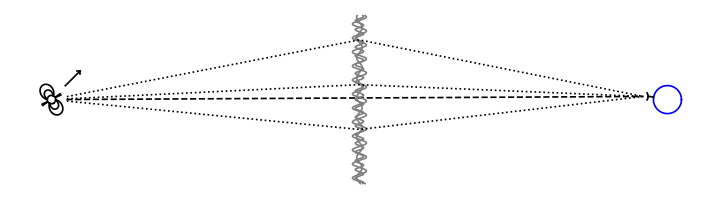
This tutorial describes how to generate synthetic data corresponding to a single-dish observation of a pulsar whose radiation is scattered by a single one-dimensional screen. The schematic below gives an overview of the system in this example, showing how beams of radiation go from the pulsar to Earth via the different images on the scattering screen.
The combined codeblocks in this tutorial can be downloaded as a Python script and as a Jupyter notebook:
- Python script:
- Jupyter notebook:
Preliminaries
Start with some standard imports. This includes a colormap to use for phases,
for which we use our own perceptually uniform colormap phasecmap from
screens.visualization.
import numpy as np

import matplotlib.pyplot as plt
import matplotlib.cm as cm
from matplotlib.colors import LogNorm

from astropy import units as u
from astropy import constants as const

from screens.visualization import phasecmap
Also define a function to make two-dimensional phase-intensity colorbars, for plotting dynamic wavefields.
def phase_intensity_colorbar(fig, ax, phasecmap, ampmax=1.):

    cbar = fig.colorbar(cm.ScalarMappable(), ax=ax, aspect=7.5)
    cbar_pos = fig.axes[-1].get_position()
    cbar.remove()

    nph = 36
    nalpha = 256
    phases = np.linspace(-np.pi, np.pi, nph, endpoint=False) + np.pi/nph
    alphas = np.linspace(0., 1., nalpha, endpoint=False) + 0.5/nalpha
    phasegrid, alphagrid = np.meshgrid(phases, alphas)

    cax = fig.add_axes(cbar_pos)
    cax.imshow(phasegrid, alpha=alphagrid,
               origin='lower', aspect='auto', interpolation='none',
               cmap=phasecmap, extent=[-np.pi, np.pi, 0., ampmax])
    cax.xaxis.tick_top()
    cax.xaxis.set_label_position('top')
    cax.yaxis.tick_right()
    cax.yaxis.set_label_position('right')
    cax.set_xticks([-np.pi, 0., np.pi])
    cax.set_xticklabels([r'$-\pi$', '0', r'$\pi$'])
    cax.set_xlabel('phase (rad)')
    cax.set_ylabel('normalized intensity')
Setting up a scattering screen
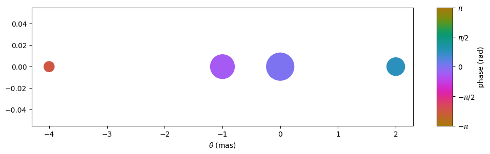
Set up the screen by defining the angles \(\boldsymbol{\theta}\) between the line of sight and the scattering points, parallel to the direction of the effective velocity. In this example, we want to mimic a one-dimensional screen with three scattered images, along with the line-of-sight image. Hence, the array of angles \(\boldsymbol{\theta}\) contains \(n_\theta = 4\) points.
theta = [-4., -1., 0., 2.] << u.mas
Create the complex magnifications \(\boldsymbol{\mu}\) corresponding to the scattering points (setting the magnification amplitudes and the intrinsic phases of the lens images). For this example, normalize the magnifications so the amplitudes add up to unity (this will lead to a dynamic spectrum with a mean of unity).
magnification = [-0.1 - 0.1j,
                 0.7 - 0.3j,
                 1.,
                 0.3 + 0.3j]
magnification /= np.sqrt((np.abs(magnification)**2).sum())
Have a look at the lens, using a scatter plot where the sizes of the points show the amplitudes of the magnifications and their colours indicate the intrinsic phases imparted by the lens.
plt.figure(figsize=(12., 3.))
plt.scatter(theta, np.zeros_like(theta),
            s=np.abs(magnification)*2000., c=np.angle(magnification),
            cmap=phasecmap, vmin=-np.pi, vmax=np.pi)

plt.xlabel(rf"$\theta$ ({theta.unit.to_string('latex')})")

cbar = plt.colorbar(aspect=7.5)
cbar.set_label('phase (rad)')
cbar.set_ticks([-np.pi, -np.pi/2., 0., np.pi/2., np.pi])
cbar.set_ticklabels([r'$-\pi$', r'$-\pi/2$', '0', r'$\pi/2$', r'$\pi$'])

plt.show()
Set up observing parameters
Set the parameters that describe the observation: the central observing frequency \(f_\mathrm{obs}\), the bandpass \(\Delta f\), the observation length \(\Delta t\), the number of frequency channels \(n_f\), and the number of time bins \(n_t\).
fobs = 316. * u.MHz
delta_f = 2. * u.MHz
delta_t = 90. * u.minute
nf = 200
nt = 180
Set up grids of observing frequencies \(f\) and times \(t\). Then make the frequency grid a row vector with shape (1, \(n_f\)) and the time grid a column vector with shape (\(n_t\), 1), so they will be broadcast against each other correctly.
f = (fobs + np.linspace(-0.5*delta_f, 0.5*delta_f, nf, endpoint=False)
     + 0.5*delta_f/nf)
t = np.linspace(0.*u.minute, delta_t, nt, endpoint=False) + 0.5*delta_t/nt

f, t = np.meshgrid(f, t, sparse=True)
Already define an extent for plotting the dynamic wavefield and dynamic spectrum.
ds_extent = (t[0,0].value  - 0.5*(t[1,0].value - t[0,0].value),
             t[-1,0].value + 0.5*(t[1,0].value - t[0,0].value),
             f[0,0].value  - 0.5*(f[0,1].value - f[0,0].value),
             f[0,-1].value + 0.5*(f[0,1].value - f[0,0].value))
Generate the dynamic wavefield
Set the parameters of the system: the effective distance \(d_\mathrm{eff}\) and the effective proper motion \(\mu_\mathrm{eff}\).
d_eff = 0.5 * u.kpc
mu_eff = 50. * u.mas / u.yr
Create the dynamic wavefields due to each of the scattering points. The dynamic wavefield \(W_j\) of screen image \(j\) is given by
theta_t = theta[:, np.newaxis, np.newaxis] + mu_eff * t
tau_t = (((d_eff / (2*const.c)) * theta_t**2)
         .to(u.s, equivalencies=u.dimensionless_angles()))

phasor = np.exp(1j * (f * tau_t * u.cycle).to_value(u.rad))
dynwaves = phasor * magnification[:, np.newaxis, np.newaxis]
In this calculation, the dimensions of the array of angles \(\boldsymbol{\theta}\) and the array of complex magnifications \(\boldsymbol{\mu}\) are increased to accommodate for the time and frequency grids. The end result is an array of shape (\(n_\theta\), \(n_t\), \(n_f\)), each entry being a complex number that contains the amplitude and phase of the dynamic wavefield.
Note
The screens.fields module contains the function
dynamic_field() to quickly generate a cube of
dynamic wavefields from a set of scattering points defined by their angles
and magnifications.
Because this function handles two-dimensional lenses, it is necessary to pass it the angles both parallel to and perpendicular to the effective velocity vector. For this example, we want to mimic a one-dimensional screen, in which all points appear to be on a line that intersects with the pulsar. Hence, we set the perpendicular angles to zero.
from screens.fields import dynamic_field

theta_par = theta
theta_perp = np.zeros_like(theta)

dynwaves = dynamic_field(theta_par, theta_perp, magnification,
                         d_eff, mu_eff, f, t)
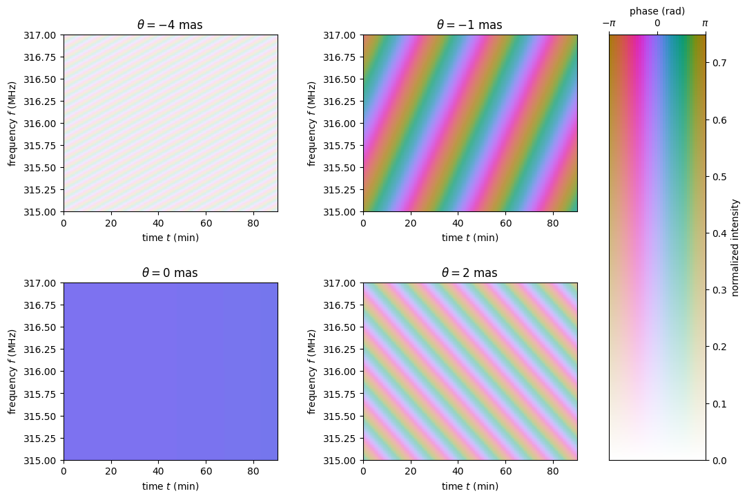
Have a look at the dynamic wavefields associated with the individual scattered images. Each panel shows the interference pattern caused by the difference in arrival time of radiation travelling via the scattered beam and the line-of-sight beam. It is evident that the magnifications of some of the scattering points are stronger than those of others.
fig, axes = plt.subplots(nrows=2, ncols=2, figsize=(12., 8.))
plt.subplots_adjust(wspace=0.4, hspace=0.4)
for ax, dynwave, th, mag in zip(axes.flat, dynwaves, theta, magnification):
    ax.imshow(np.angle(dynwave).T,
              alpha=np.abs(mag) / np.max(np.abs(magnification)),
              origin='lower', aspect='auto', interpolation='none',
              cmap=phasecmap, extent=ds_extent, vmin=-np.pi, vmax=np.pi)
    ax.set_title(rf"$\theta = {th.value:.0f}$"
                 rf" {theta.unit.to_string('latex')}")
    ax.set_xlabel(rf"time $t$ ({t.unit.to_string('latex')})")
    ax.set_ylabel(rf"frequency $f$ ({f.unit.to_string('latex')})")

phase_intensity_colorbar(fig, axes, phasecmap,
                         ampmax=np.max(np.abs(magnification)))

plt.show()
The dynamic wavefields corresponding to the individual scattering points still have to be summed to create the total dynamic wavefield at the telescope.
dynwave = dynwaves.sum(axis=0)
Plot the combined dynamic wavefield.
fig = plt.figure(figsize=(12., 8.))
ax = plt.subplot(111)
plt.imshow(np.angle(dynwave).T,
           alpha=(np.abs(dynwave).T / np.max(np.abs(dynwave))),
           origin='lower', aspect='auto', interpolation='none',
           cmap=phasecmap, extent=ds_extent, vmin=-np.pi, vmax=np.pi)
plt.title('dynamic wavefield')
plt.xlabel(rf"time $t$ ({t.unit.to_string('latex')})")
plt.ylabel(rf"frequency $f$ ({f.unit.to_string('latex')})")

phase_intensity_colorbar(fig, ax, phasecmap,
                         ampmax=np.max(np.abs(dynwave)))

plt.show()

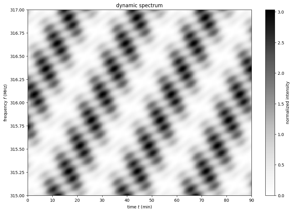
Create the dynamic spectrum
The dynamic spectrum is the square modulus of the summed dynamic wavefield.
dynspec = np.abs(dynwave)**2
Now, show the dynamic spectrum.
plt.figure(figsize=(12., 8.))
plt.imshow(dynspec.T,
           origin='lower', aspect='auto', interpolation='none',
           cmap='Greys', extent=ds_extent, vmin=0.)
plt.title('dynamic spectrum')
plt.xlabel(rf"time $t$ ({t.unit.to_string('latex')})")
plt.ylabel(rf"frequency $f$ ({f.unit.to_string('latex')})")

cbar = plt.colorbar()
cbar.set_label('normalized intensity')

plt.show()
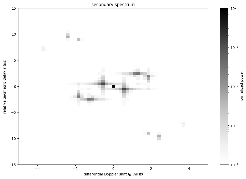
Create the conjugate spectrum and the secondary spectrum
The conjugate spectrum refers to the Fourier transform of the dynamic spectrum.
Here, the conjugate spectrum is created and normalized to its zero-frequency component, which is equivalent to normalizing to the mean of the dynamic spectrum. Afterwards, the zero-frequency component is shifted to the centre of the spectrum.
conjspec = np.fft.fft2(dynspec)
conjspec /= conjspec[0, 0]
conjspec = np.fft.fftshift(conjspec)
The conjugate variables, the relative geometric delay \(\tau\) and the differential Doppler shift \(f_\mathrm{D}\), also need to be created and shifted.
tau = np.fft.fftfreq(dynspec.shape[1], f[0,1] - f[0,0]).to(u.us)
fd = np.fft.fftfreq(dynspec.shape[0], t[1,0] - t[0,0]).to(u.mHz)

tau = np.fft.fftshift(tau)
fd = np.fft.fftshift(fd)
The secondary spectrum is the square modulus of the conjugate spectrum.
secspec = np.abs(conjspec)**2
Let’s plot the secondary spectrum.
ss_extent = (fd[0].value  - 0.5*(fd[1].value - fd[0].value),
             fd[-1].value + 0.5*(fd[1].value - fd[0].value),
             tau[0].value  - 0.5*(tau[1].value - tau[0].value),
             tau[-1].value + 0.5*(tau[1].value - tau[0].value))

plt.figure(figsize=(12., 8.))
plt.imshow(secspec.T,
           origin='lower', aspect='auto', interpolation='none',
           cmap='Greys', extent=ss_extent,
           norm=LogNorm(vmin=1.e-4, vmax=1.))
plt.title('secondary spectrum')
plt.xlabel(r"differential Doppler shift $f_\mathrm{{D}}$ "
           rf"({fd.unit.to_string('latex')})")
plt.ylabel(r"relative geometric delay $\tau$ "
           rf"({tau.unit.to_string('latex')})")
plt.xlim(-5., 5.)
plt.ylim(-15., 15.)

cbar = plt.colorbar()
cbar.set_label('normalized power')

plt.show()